
Performance Overview
The Performance Overview is the first thing you see after logging in — six KPI cards, an engagement trend line, and a posting frequency chart, all scoped to your selected time range.
What you see
KPI cards summarize your activity for the selected period. The set depends on whether Flux has started capturing daily follower snapshots for your profile (this begins automatically on your first data refresh after subscribing to a paid plan — personal profiles only):
With follower data:
- Followers — current follower count with the change since your first snapshot, shown as both a number and percentage
- Total Engagement — sum of likes, comments, and shares (or the metric you've selected)
- Eng. Rate — average engagement per post divided by your follower count, expressed as a percentage
- Avg / Post — mean engagement per post for the period
- Total Posts — count of original posts (reposts and quote posts are excluded throughout)
- Posts / Week — your average cadence; shows as "X of Y" if you've set a weekly posting goal
Without follower data (first day, or profiles that predate this feature):
- Total Posts — count of original posts
- Total Engagement — sum of likes, comments, and shares
- Median Engagement — the midpoint across your posts; half your posts beat this number
- Avg / Post — mean engagement per post for the period
- Posts / Week — your average cadence
- Best Format — the post type with the highest average engagement, shown with a multiplier (requires at least 3 posts of that type)
Each card shows a delta badge (up/down/flat arrow) when a prior period exists to compare against. A delta is shown as up or down only when the change exceeds 5%; smaller moves show as "Flat."
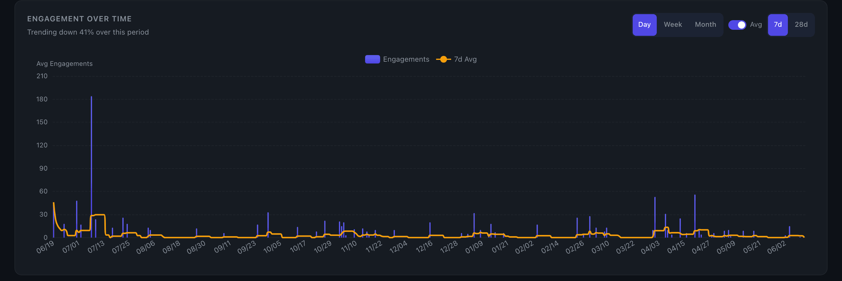
Engagement trend line is an area chart showing total engagement per post over time, with a 30-day moving average overlay. Hover any point to preview the post text and its stats. When follower data is available, a secondary y-axis shows your follower count as a line overlay, so you can see how audience growth correlates with engagement.
Posting frequency chart shows posts per week (or per month for long-range views). A dashed amber line marks your average cadence for the period. Bars use daily granularity; longer ranges switch to a line chart with an area fill.
Controls
The time range selector (90d / 6mo / 1yr / All time) applies to all three surfaces at once. See Time Controls for details on how ranges and granularity work.
The metric selector (if visible) lets you swap between total engagement, likes, comments, shares, or comment-to-like ratio. All cards and the trend line update together.
Key details
- Reposts and quote posts are excluded from every calculation on this page.
- Posts / Week uses the selected window length as the denominator (e.g. a 90-day range divides by 90 days). For "All time," it uses the span from your earliest to most recent post.
- Best Format requires a minimum of 3 posts per type to qualify, so formats you've rarely used won't surface.
- On Edge, each card may show a secondary line comparing actual engagement against the model's predicted range for that period. This requires at least 5 posts with engagement data in the window.
Tips
- Eng. Rate normalizes for audience size — it's the best single number for comparing your content quality over time, even as your follower count grows.
- If the Followers delta is growing but Eng. Rate is flat or declining, your new followers may be less engaged than your core audience. Dig into specific posts to see what's resonating.
- Without follower data, the Median card is often more useful than the average — a few viral posts can pull the average up significantly while most posts perform much lower.
- If Best Format shows a multiplier above 1.5x (visible when follower data isn't available), that's a strong signal to lean into that format. Cross-reference with the Content Type Breakdown chart for the full ranking.
- Switching to "All time" with the posting frequency chart is a quick way to spot gaps in your consistency — extended flat stretches are visible at a glance.
- For a deeper view of follower trends over time, see the Follower Growth chart.